

티스토리 뷰
교안파일
*샘플 싸이트
https://parkinwook.github.io/TEST3.github.io/

html 코드
<!DOCTYPE html>
<html lang="en">

<head>
    <meta charset="UTF-8">
    <meta http-equiv="X-UA-Compatible" content="IE=edge">
    <meta name="viewport" content="width=device-width, initial-scale=1.0">
    <title>Document</title>


    <!-- css링크 -->
    <link rel="stylesheet" href="css/bootstrap.min.css">
    <!-- 제이쿼리 링크 -->
    <script src="jquery/jquery-3.6.3.min.js"></script>
    <!-- 부트스트랩 테마가 필요하면 이쯤 추가.. -->
    <!-- js링크 -->
    <script src="js/bootstrap.min.js"></script>

    <link rel="stylesheet" href="index02(선생님).css">


</head>

<body>

    <!-- 부트스트랩 col이용해서 디자인 -->
    <!-- https://parkinwook.github.io/TEST3.github.io/ -->

    <section>
        <div class="container">

            <h3>상세내용</h3>

            <div class="row">
                <div class="col-sm-6 col-xs-12">
                    <img src="img/mask.jpg" alt="이미지">
                </div>
                <div class="col-sm-6 col-xs-12">

                    <div class="detail"><!-- 위 -->
                        <p class="title">[게릴라특가] 30일체험가능! 벨라페이스 3컬러 LED마스크 눈마사지 겸용/4단계 시간조절/피부홈케어 +사은품까지!</p>
                        <p class="price">135,000원</p>
                        <p class="deliver">무료배송<br>
                           상품별배송 ㅣ 택배배송 ㅣ당일출고, 12시 이전 결제 건까지 해당 (주말, 공휴일 제외)</p>
                    </div>

                    <div class="detail-control"><!-- 아래 -->
                        <div class="price">
                            <p class="left">총상품금액</p>
                            <p class="right">0원</p>
                        </div>
                        <div class="order">
                            <button class="left btn btn-default">장바구니</button>
                            <button class="right btn btn-primary">구매하기</button>
                        </div>
                    </div>

                </div>
            </div>
        </div>
    </section>

    <section style="margin-top: 70px;">
        <div class="container">
            <div class="row">
                <div class="col-xs-12">

                    <form class="reply-wrap">

                        <div class="reply-img">
                            <img src="img/profile.png" alt="프로필">
                        </div>

                        <div class="reply-content">
                            <textarea class="form-control" placeholder="500글자 이내"></textarea>
                            <div class="reply-control">
                                <div class="left"><!-- 왼 -->
                                    <input type="text" class="form-control" placeholder="아이디">
                                    <input type="password" class="form-control" placeholder="비밀번호">
                                </div>
                                <button class="right btn btn-success">등록하기</button>
                            </div>
                        </div>
                    </form>


                </div>
            </div>
        </div>
    </section>


</body>

</html>
*css코드
* {padding: 0; margin: 0; line-height: none;}
img {max-width: 100%; height: auto;}
.btn {border-radius: 0;}
.form-control {border-radius: 0;}


.detail {min-height: 370px;}
.detail .title{font-size: 25px;}
.detail .price{
    font-size: 25px;
    font-weight: 700;
    border-top: 1px solid #ddd;
    border-bottom: 1px solid #ddd;
    padding: 10px 0;

}
.detail .deliver{font-size: 12px; color: #888;}


.detail-control .price,
.detail-control .order  {
    overflow: hidden;
}
.detail-control .price .left {float: left; font-weight: 500; height: 29px; line-height: 29px;}
.detail-control .price .right {float: right; font-size: 20px; font-weight: 700; height: 29px;}

.detail-control .order .left {float: left; width: 50%; padding: 10px 0;}
.detail-control .order .right {float: right; width: 50%; padding: 10px 0;}


/* *****댓****** */
.reply-wrap {
    border: 1px solid #ddd;
    background-color: #f5f5f5;
    position: relative;
    padding: 15px;
}

.reply-img {
    position: absolute;
    left: 15px;
    top:15px;
}
.reply-content {
    padding-left: 55px;
}
.reply-content textarea {
    resize: vertical;
    height: 70px;
    margin-bottom: 5px;
    transition: all .3s ease-in-out;
}
.reply-content textarea:focus {
    height: 150px;
}
.reply-control {overflow: hidden;}
.reply-control .left {float: left;}
.reply-control .left input:nth-child(1) {
    margin-bottom: 5px;
}

.reply-control .right {float: right;}
# 유용한 선택자 지정법 중 하나
#글리피콘

이런 모양을 글리피콘이라고 함.
-부트 스트랩 공식 싸이트에도 글리피콘이 있고.
http://bootstrapk.com/components/
-검색창에 무료 글리피콘 치면 또 다양한 글리피콘 제공해주는 싸이트가 있음
글리피콘 알집을 다운 받아서 폴더에 넣어주고
가져다 쓰면된다고 함.
무료 글리피콘 괜찮다고 하는 싸이트 주소
<FLEX 문법> -> 위에 교안파일 있음.
참고하기 좋은 블로그
https://heropy.blog/2018/11/24/css-flexible-box/
CSS Flex(Flexible Box) 완벽 가이드
많은 경우 float, inline-block, table 등의 도움을 받아서 수평 레이아웃을 구성하지만 이는 차선책이며, 우리는 Flex(Flexible Box)라는 명확한 개념(속성들)으로 레이아웃을 쉽게 구성할 수 있습니다. CSS F
heropy.blog
-단점: 신규문법이기 때문에
IE(인터넷 익스플로러) 기준으로 디자인 할 때는 사용할 수 없음.
IE 기준으로 디자인 할 때는 display, flat, position 이 문법 정도만 사용할 수 있음.
우리나라는 아직까지 IE 기준으로 작업하는 곳이 많음.
-주의점:
ui를 잡을 때 flex를 사용했다면 float같은 다른거를 사용하지않고
flex로만 사용을 해주는게 좋음. 그래야 적용이 안되는 일이 발생하지 않음.
꼭 짬뽕으로 사용하지 않도록 하자.

-컨테이너(부모박스)에 사용가능한 속성이 있고
아이템(자식박스)에 적용가능한 속성이 있다.

*display 는 무조건 들어가야함.
*flex-direction
- 아이템이 정렬되는 방향이라고 보면됨.
-cross-axis 교차
*flex-wrap
*justify-content
-주축의 정렬 방법
* align-content, align-items 는 교차 축의 정렬을 담당.

*flex박스의 옵션
-부모님 박스가 block 형식으로 배치되게하는건 flex
-부모 박스가 inline 형식으로 배치되게하는걸 inline-flex
보통 block 형식으로 많이 배치함.

*row 라고 하면 아이템의 배치구조가 가로로.
주축은 가로가 됨.
아이템의 정렬방식 = 가로.
-주축이 가로면 교차축은 세로가 됨.
*column 세로방향으로 배치구조가 만들어짐.
주축도 세로가 됨.
아이템의 정렬방식 또한 세로로.
-주축이 세로면 교차축은 가로가 됨.
*reverse 를 뒤에 붙여주면 반대방향에서부터 정렬이 됨.
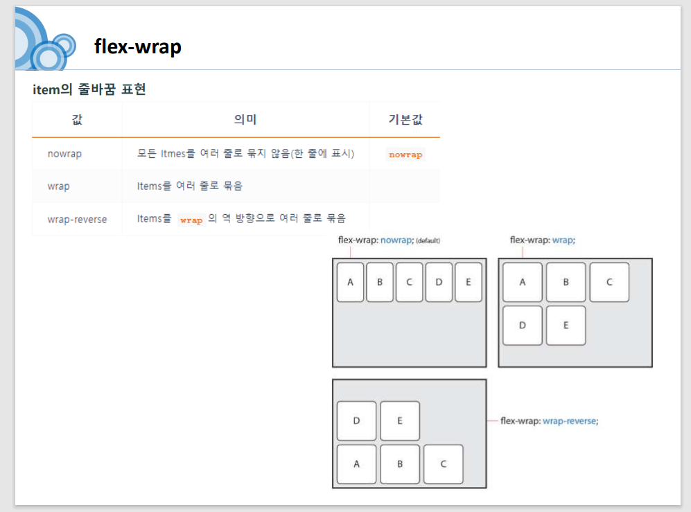
-nowrap 랑 wrap 만 비교할 수 있으면 됨.
#flex-flow
-flex- direction과
flex-wrap을 한번에 설정해줄 수 있게해줌.
flex-flow:row wrap;코드
<!DOCTYPE html>
<html lang="en">
<head>
    <meta charset="UTF-8">
    <meta http-equiv="X-UA-Compatible" content="IE=edge">
    <meta name="viewport" content="width=device-width, initial-scale=1.0">
    <title>Document</title>

    <style>
        .box{background-color: yellow; padding: 10px; /*height:200px*/}
        .box .item{background-color: green; width:50px; height: 50px;}

        .container{
            /*flex기본 item의 너비만큼 가로배치*/
            /*flex - 블럭배치, inline-flex : 인라인배치*/
            display: flex;
            /*주축 설정 row 기본값*/
            /*세로-column*/
            flex-direction:row;
        }

    </style>

</head>
<body>

    <h3>유연한 박스 flex</h3>

    <div class="container box">
        <div class="item">hello</div>
        <div class="item">hello</div>
        <div class="item">hello</div>
    </div>

    <hr>

    <!--
        <div class="container box">
        <div class="item">hello</div>
        <div class="item">hello</div>
        <div class="item">hello</div>
    </div>
-->


    <style>
        .box{background-color: yellow; padding: 10px;}
        .box .item{background-color: green; width:50px; height: 50px; margin:10px}

        .container2{
            display: flex;
            /* flex-flow는 direction과, wrap을 같이 작성하는 속성*/
            flex-flow:row wrap;
            /* flex-direction: row; flex-wrap: wrap; */
             /*더이상 공간이 없을 때 줄바꿈처리, 기본값 nowrap*/
        }

    </style>

    <h3>flex-wrap(줄바꿈) flex</h3>

    <div class="container2 box box2">
        <div class="item">hello</div>
        <div class="item">hello</div>
        <div class="item">hello</div>
        <div class="item">hello</div>
        <div class="item">hello</div>
        <div class="item">hello</div>
    </div>

</body>
</html>
==============================================================

- 주축정렬 -
*space-between
-끝에 붙이고 사이를 균등한 간격으로 배치
*space-around
-끝에 안 붙이고 사이를 균등한 간격으로 정렬
-아이템 사이균등

*space-evenly
-양끝과 아이템 사이가 균등

코드

#교차축 정렬 (한줄일 때)
*baseline (이건 잘 안씀.)
상자들 크기가 다를 때 글자 정렬선에 맞춰줌.

#교차축 정렬(두줄이상일 때)
코드
<!DOCTYPE html>
<html lang="en">

<head>
    <meta charset="UTF-8">
    <meta http-equiv="X-UA-Compatible" content="IE=edge">
    <meta name="viewport" content="width=device-width, initial-scale=1.0">
    <title>Document</title>

    <style>
        .box {
            background-color: yellow;
            padding: 10px;
            height: 500px;
        }

        .box .item {
            background-color: green;
            width: 50px;
            height: 50px;
            margin: 10px
        }

        .container {
            display: flex;
            flex-direction: column;

            /*주축 정렬*/
            /*아이템 사이균등*/
            justify-content: space-around;

            /*양끝은 붙이고 사이균등*/
            /* justify-content: space-between; */

            /*양끝과 아이템 사이균등*/
            /* justify-content: space-evenly; */
        }
    </style>

</head>

<body>

    <h3>justify-content(주축정렬)</h3>

    <div class="container box">
        <div class="item">hello</div>
        <div class="item">hello</div>
        <div class="item">hello</div>
        <div class="item">hello</div>
    </div>

    <hr>

    <h3>aling-item(교차축정렬 - 한줄일때)</h3>

    <style>
        .box {
            background-color: yellow;
            padding: 10px;
            height: 500px;
        }

        .box .item2 {
            background-color: green;
            width: 50px;
            margin: 10px;
            height: 50px;
        }

        .container2 {
            display: flex;
            /*교차축 정렬*/
            /*item 높이가 고정이면 안됩니다.*/
            /*align-items:stretch;*/ /*잡아당김*/
            /* align-items:flex-start */ /*수직 위*/
            /*align-items: flex-end;*/ /*수직 아래*/
            /*align-items: center;*/ /*수직 중앙*/
            align-items:baseline; /*아이템의 문자들 기준으로 수직정렬*/
        }
    </style>

    <div class="container2 box">
        <div class="item2" style="line-height:50px;">hello</div>
        <div class="item2" style="line-height:70px;">hello</div>
        <div class="item2">hello</div>
        <div class="item2">hello</div>
    </div>

    <hr>
    <h3>aling-content(교차축 정렬 - 두줄 이상)</h3>

    <style>
        .box {
            background-color: yellow;
            padding: 10px;
            height: 500px;
        }

        .box .item3 {
            background-color: green;
            width: 50px;
            margin: 10px;
            height: 50px;
        }

        .container3 {
            display: flex;
            flex-direction:column;
            flex-wrap: wrap;

            /*교차축 정렬 - 두줄 이상*/
            /* item 높이가 없어야 함*/
            /* align-content: stretch; */

            /* align-content: flex-start; */
            /* align-content:flex-end; */
            /* align-content: center; */
            /* align-content: space-around; */
            align-content: space-between;
        }
    </style>

    <div class="container3 box">
        <div class="item3">hello</div>
        <div class="item3">hello</div>
        <div class="item3">hello</div>
        <div class="item3">hello</div>
        <div class="item3">hello</div>
        <div class="item3">hello</div>
        <div class="item3">hello</div>
        <div class="item3">hello</div>
        <div class="item3">hello</div>
        <div class="item3">hello</div>
    </div>

</body>

</html>
=================================================================
<자식 박스에 적용하는 속성>


<!DOCTYPE html>
<html lang="en">
<head>
<meta charset="UTF-8">
<meta http-equiv="X-UA-Compatible" content="IE=edge">
<meta name="viewport" content="width=device-width, initial-scale=1.0">
<title>Document</title>
<style>
.box{background-color: yellow; padding: 10px; height:500px}
.box .item{background-color: green; width:50px; height: 50px; margin:10px}
.container{
display: flex;
}
/*grow, shrink 컨테이너 사이즈가 변할 때, 아이템이 증가되거나, 감소되는 비율(속도)*/
/*basis 아이템 너비에 대한 비율 (기본값은 auto이며, 없으면 width따라갑니다.)*/
.item1{
/* flex-grow:2; */
/* flex-shrink:2;
flex-basis:33.3333%; */
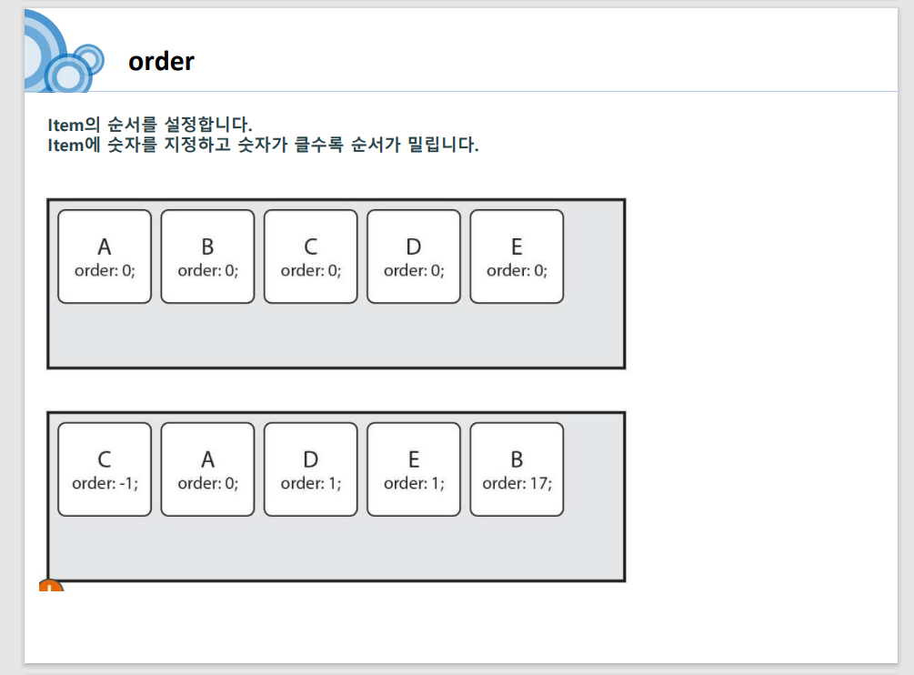
flex: 2 2 33.3333%;
order: 10;
}
.item2{
/* flex-grow:1; */
/* flex-shrink:1;
flex-basis:33.3333%; */
flex: 1 1 33.3333%;
order: 1;
}
.item3{
/* flex-grow:0; */
/* flex-shrink:0;
flex-basis:33.3333%; */
flex: 0 0 33.3333%;
order: 5;
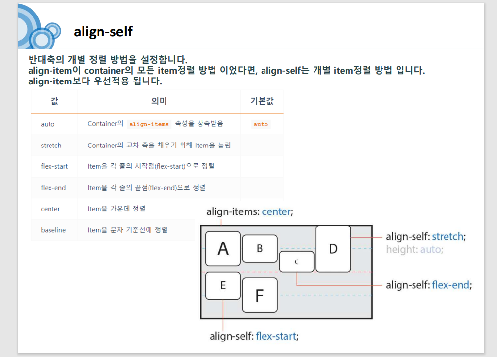
align-self: center; /*아이템 하나만 교차축정렬*/
}
</style>
</head>
<body>
<h3>item에 적용하는 속성들</h3>
<div class="container box">
<div class="item item1">1</div>
<div class="item item2">2</div>
<div class="item item3">3</div>
</div>
</body>
</html>
<디자인 공부해나갈 방향>
* 우선 기본을 먼저 확실히 하고 나서 추가로 새로운 것을 공부해나가야한다.
*css에 움직이는 효과를 주고싶을 때
animation 공부
'CSS' 카테고리의 다른 글
| 22-12-26 반응형 디자인, 부트스트랩 (0) | 2022.12.26 |
|---|---|
| 22-12-23 CSS - 디자인 실습 (0) | 2022.12.23 |
| 22-12-22 css - 박스레이아웃(position) (1) | 2022.12.22 |
| 22-12-21 css기초- 패딩과마진 , 박스사이징,박스레이아웃, float (0) | 2022.12.21 |
| 22-12-20 css기초 - 단위, 선택자, 폰트, border속성, 텍스트 속성, 텍스트 정렬, display속성, background속성 (0) | 2022.12.20 |
- Total
- Today
- Yesterday
- 알람 시계 문제
- 배열과 탐색
- 다중 반복문
- 강남역 12번 춣구
- 국비학원 수업
- 조건문
- api 활용
- FOR문
- interface #자바
- output 스트림
- 자바스크립트 ES6 문법
- 오코노라멘
- 박인욱 강사님
- 데이터베이스 수업
- 국비지원 학원 수업 내용
- 가비지 콜렉팅
- 중앙정보처리학원
- input 스트림
- 강남 중앙정보처리학원
- 자바
- 박문석 선생님
- 내포 클래스
- 국비학원
- nasted class
- 자바 api
- 배열 삭제
- 자바#자바수강기록
- 배열의 정렬
- 자바수업
- JS ES6 문법
| 일 | 월 | 화 | 수 | 목 | 금 | 토 |
|---|---|---|---|---|---|---|
| 1 | 2 | 3 | ||||
| 4 | 5 | 6 | 7 | 8 | 9 | 10 |
| 11 | 12 | 13 | 14 | 15 | 16 | 17 |
| 18 | 19 | 20 | 21 | 22 | 23 | 24 |
| 25 | 26 | 27 | 28 | 29 | 30 | 31 |