22-12-26 반응형 디자인, 부트스트랩

빨간 체크 부분을 주의해서 봐보자.
선택자 지정시
li.m0 이렇게 붙여서도 사용 가능.
li.m0-> li 이면서 m0 클래스를 갖고 있는 것을 의미.
#반응형 디자인
*미디어 쿼리
사이즈에 따라서 바뀔 디자인을 2개이상 만들어 놓음.
-html 코드
<!DOCTYPE html>
<html lang="en">
<head>
    <meta charset="UTF-8">
    <meta http-equiv="X-UA-Compatible" content="IE=edge">
    <meta name="viewport" content="width=device-width, initial-scale=1.0">
    <title>Document</title>

    <style>
        /*사이즈를 퍼센트로 주면 화면의 크기가 변함에 따라 태그의 크기도 변함*/
        .box{width: 100%;}
        .box .inner{border: 1px solid #777; box-sizing: border-box;}

        /*1300px 이상에서 동작하는 디자인*/
        @media(min-width: 1300px){
            .box .inner{float: left; width: 33.3333%; }
        }

        /*1299이하 ~ 768px이상*/
        @media(max-width:1299px) and (min-width:768px){
            .box .inner {float: left; width: 50%;}
        }

        /*767px 아래에서 동작하는 디자인*/
        @media(max-width: 767px){
            .box .inner{float: left; width: 100%; }
        }

    </style>

</head>
<body>

    <h3>반응형디자인 media</h3>

    <div class="box">
        <div class="inner">박스</div>
        <div class="inner">박스</div>
        <div class="inner">박스</div>
        <div class="inner">박스</div>
        <div class="inner">박스</div>
        <div class="inner">박스</div>
    </div>

</body>
</html>
*부트스트랩 (프론트엔드 프레임워크)
설명:
부트스트랩은 웹사이트를 쉽게 만들 수 있게 도와주는 CSS, JS 프레임워크이다. 하나의 코드로 휴대폰, 태블릿, 데스크탑까지 다양한 기기에서 작동하게 만들 수 있으며, 다양한 기능을 제공하여 사용자가 쉽게 웹사이트를 제작, 유지, 보수할 수 있도록 도와준다
-by. 위키백과-
-무료 html 템플릿 참조 사이트
-초보자들이 사용하기에는 굉장히 좋음.
하지만 어느정도 디자인 실력이 쌓였다면 안 쓰는게 더 좋음.
-버젼별로 쓰인 문법이 다름 .
우리가 배운건 3버젼의 float
-버젼3 싸이트 주소:
http://bootstrapk.com/getting-started/
우리는 기본 방식인
CDN 방식으로 사용하면됨
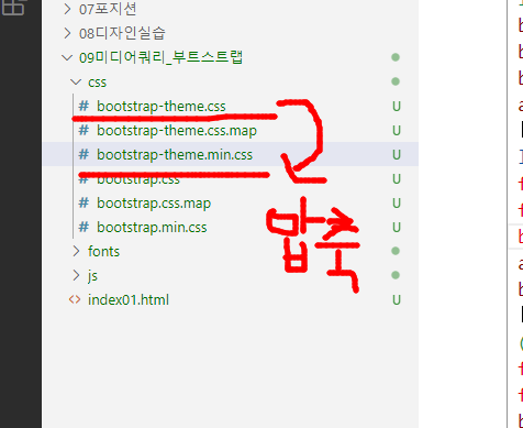
-부트스트랩 적용하는 법
아래와 같이 3개를 꼭 링크를 연결해줘야한다.
작성하는 순서도 지켜져야함.

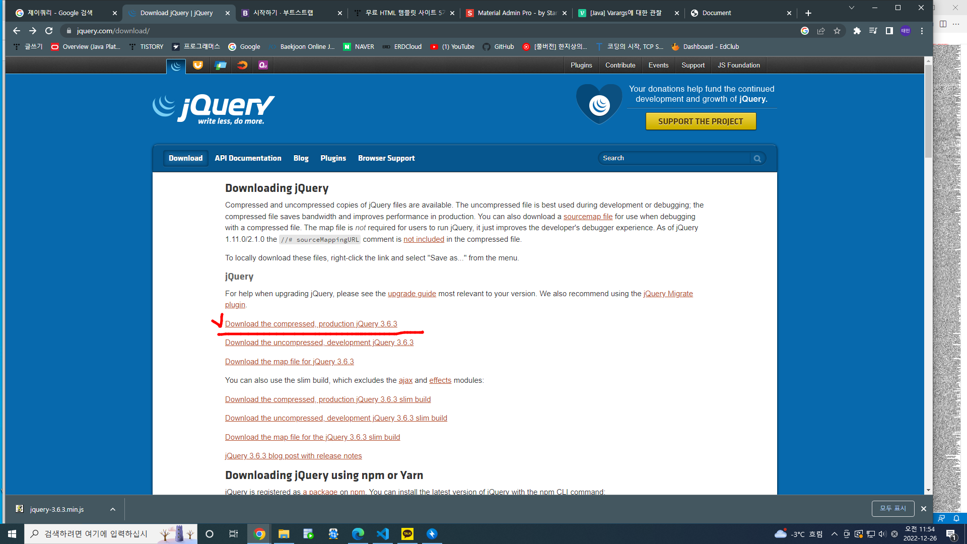
누르면

이 창이 나오는데 여기서 우클릭. 다른이름으로 저장
그리고나서 저장한 파일을

이렇게 파일을 넣어준다.
그리고나서 우측에 코드와 같이 링크를 작성해준다.
*Grid

https://www.w3schools.com/bootstrap/bootstrap_grid_system.asp

-그리드 형식 과 모달 쓰는 것 쓸만하니 알아두기.
*Modal 창
참고 주소 :
https://www.w3schools.com/bootstrap/bootstrap_modal.asp
<!DOCTYPE html>
<html lang="en">
<head>
<meta charset="UTF-8">
<meta http-equiv="X-UA-Compatible" content="IE=edge">
<meta name="viewport" content="width=device-width, initial-scale=1.0">
<title>Document</title>
<!--css링크-->
<link rel="stylesheet" href="css/bootstrap.min.css">
<!--제이쿼리 링크-->
<script src="jquery/jquery-3.6.3.min.js"></script>
<!--부트스트랩 테마가 필요하면 이쯤 추가..-->
<!--js링크-->
<script src="js/bootstrap.min.js"></script>
</head>
<body>
<!-- Trigger the modal with a button -->
<button type="button" class="btn btn-info btn-lg" data-toggle="modal" data-target="#myModal">모달버튼1</button>
<!-- Trigger the modal with a button -->
<button type="button" class="btn btn-info btn-lg" data-toggle="modal" data-target="#home">모달버튼2</button>
<!-- Modal -->
<div id="myModal" class="modal fade" role="dialog">
<div class="modal-dialog">
<!-- Modal content-->
<div class="modal-content">
<div class="modal-header">
<button type="button" class="close" data-dismiss="modal">×</button>
<h4 class="modal-title">Modal Header</h4>
</div>
<div class="modal-body">
<p>첫번째 모달</p>
</div>
<div class="modal-footer">
<button type="button" class="btn btn-default" data-dismiss="modal">Close</button>
</div>
</div>
</div>
</div>
<!-- Modal -->
<div id="home" class="modal fade" role="dialog">
<div class="modal-dialog">
<!-- Modal content-->
<div class="modal-content">
<div class="modal-header">
<button type="button" class="close" data-dismiss="modal">×</button>
<h4 class="modal-title">Modal Header</h4>
</div>
<div class="modal-body">
<p>두번째 모달</p>
</div>
<div class="modal-footer">
<button type="button" class="btn btn-default" data-dismiss="modal">Close</button>
</div>
</div>
</div>
</div>
</body>
</html>
*Dropdown
https://www.w3schools.com/bootstrap/bootstrap_dropdowns.asp
*Popover
https://www.w3schools.com/bootstrap/bootstrap_popover.asp
* Tooltip (hover)
https://www.w3schools.com/bootstrap/bootstrap_tooltip.asp
<기억할 것>
*가상선택자 보는 법

*디자인할 때 이건 꼭 넣어주고 디자인을 시작하자
* {padding: 0; margin: 0; list-style:none;}
img{max-width: 100%; height:auto;}